A/W 2024
Key Colours for A/W 24/25
WGSN and Coloro present their Key Colors for A/W 24/25, which are aligned with influences that will drive consumers, including a focus on wellbeing, creativity, the environment and technology.
WGSN, the global authority on consumer and design trends, and Coloro, the global authority on the future of colour, announced the colours that will be adopted by 2025.
As consumers continue to grapple with ongoing economic, political and environmental crises, a sense of uncertainty about the future will remain a dominant force. As a result, our Global Colour Forecast aligns with influences that will drive consumers as we head into 2025, including wellbeing, creativity, the environment and technology.
The Key Colours for A/W 24/25 are Intense Rust, Midnight Plum, Sustained Grey, Cool Matcha and Apricot Crush.
Colour of the Year 2024:
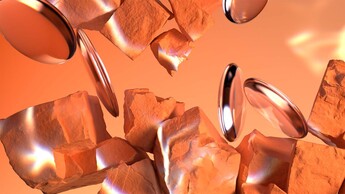
Apricot Crush - 02465-27
WGSN first forecast Apricot Crush as a key colour for A/W 23/24, aligning with a focus on balanced lifestyles that nourish the body and mind. Moving it into Colour of the Year 2024 signifies the importance of orange as a versatile, transseasonal shade. Reflecting WGSN’s commitment to colour longevity and sustainability goals, Apricot Crush’s restorative attributes will appeal across fashion, beauty, interiors and consumer tech.
This balancing bright is an activating vitamin tone that embodies a full spectrum approach to health and wellbeing. Encompassing the natural vitamin- and antioxidant-rich benefits of apricots and oranges, it also draws from the beauty found in nature. Through times of so much uncertainty, Apricot Crush continues to confirm its importance, acting as a colour full of hope and positivity.
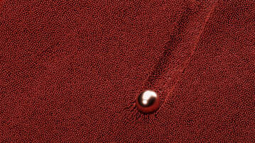
Intense Rust - 015-33-25
First forecast for A/W 23/24, Intense Rust returns to the palette for A/W 24/25 as a key colour. The warm and rich shade of Intense Rust is a transseasonal brown that evokes feelings of stability. Balancing luxury with a raw, earthy edge, this colour is reminiscent of soil, full of warmth and calm textures. It’s inspired by consumers increasingly valuing sustainability over newness, re-sale culture and products with long-term appeal. This colour communicates authenticity, quiet luxury and promotes a return of classic design.
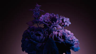
Midnight Plum - 151-22-09
Midnight Plum - 151-22-09
Midnight Plum is a powerful dark purple that connects to themes of space exploration and the metaverse. NASA’s James Webb Telescope images opened up the possibility to unravel mysteries about the origins of the universe, allowing colours in space to capture our imaginations. A tinted dark close to black, this colour celebrates darkness, connecting to a sense of mystery as well as gothic and underground sentiments. It aligns with the increasing consumer desire for escapism.
Sustained Grey - 035-73-04
Sustained Grey - 035-73-04
Sustained Grey confirms the continuing importance of neutrals and more sustainable colour choices, which celebrates recyclability and the pursuit of ‘just enough’. Representing practicality and reliability, this colour is foundational and grounding with a utilitarian edge. It speaks to promoting balance and slowing down, as a timeless shade with transseasonal and long-term appeal.
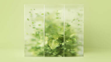
Cool Matcha - 055-85-20
Cool Matcha - 055-85-20
Cool Matcha is a tinted pastel with a soothing and calm quality. Connecting both nature and technology, it highlights the importance of developments in nature-powered bio and plant-based materials, dyes, pigments and energy sources. As consumers continue to deal with feelings of anxiety and stress, we look to colour to help soothe the mind and bring a sense of rest and reflection. Cool Matcha is a quiet, pacifying pale with a therapeutic quality and is the perfect combination of a vegetal green and mindful pastel.
